


 27 148

[(Fig._2)TD$FIG]
1
2
14
3
13
12
10
5
8
4
6 7
9
11
£3,000
£4,000
£5,000
£6,000
£7,000
8.20
8.30
8.40
8.50
8.60
8.70
8.80
LifeƟme costs
LifeƟme health outcomes, QALYs
Strategies with non-zero probability of being in fronƟer
Strategies forming the fronƟer at expected values
Strategies never forming the fronƟer
1 - M1 115
2 - M1 215
3 - M3 215
4 - M4 225
5 - M7 225
6 - M3 224
7 - M4 224
8 - M7 224
9 - T6 223
10 - T6 222
11 - M7 223
11 - T7 223
13 - M7 222
14 - P4 2
1
14
2
13
11
9
4
7
3
5
6
8
12
10
£0
£250
£500
£750
£1,000
£1,250
£1,500
A
B
0.00
0.20
0.40
0.60
0.80
1.00
derrefer nam rep gnitset fo tsoC
ProporƟon of CS cancers detected
Strategies with non-zero probability of being in fronƟer
Strategies forming the fronƟer at expected values
Strategies never forming the fronƟer
1 - M1 215
2 - M3 215
3 - M3 225
4 - M4 225
5 - M7 225
6 - M3 224
7 - M4 224
8 - M7 224
9 - T6 223
10 - T6 222
11 - M7 223
12 - T7 223
13 - M7 222
14 - P4 2
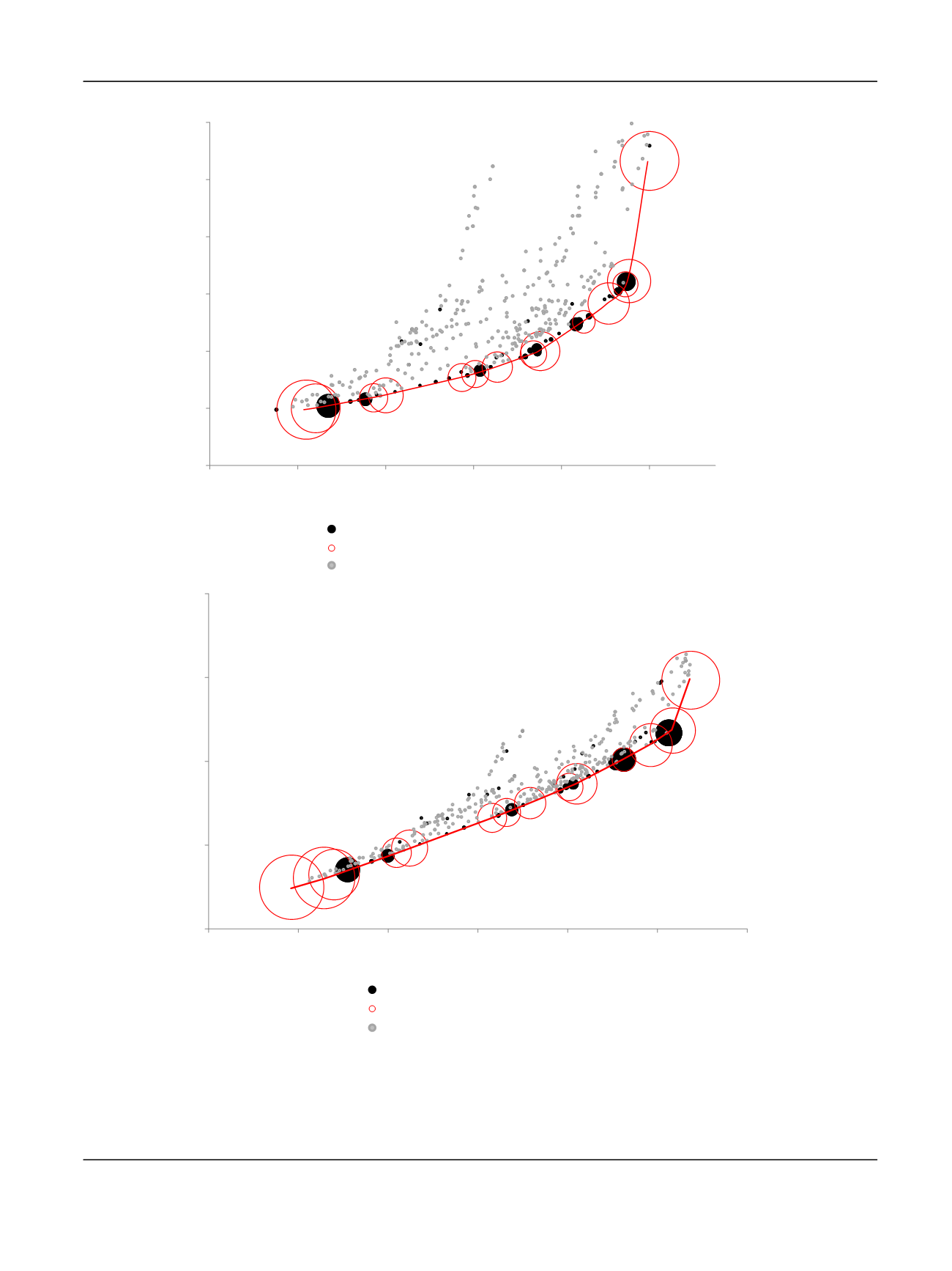
Fig. 2
–
(A) Detection of CS cancers per pound spent in diagnosis. (B) Quality-adjusted life years (QALYs) per NHS spend. Each bubble represents one of
the 383 diagnostic strategies evaluated; their size is directly related to the probability that the strategy is cost effective and therefore forms the
frontier (ie, forms the red line). The red bubbles represent the 14 diagnostic strategies that form the frontier at expected values. This means that, on
average, these are the best strategies per pound spent. The black bubbles represent the strategies that do not form the frontier at expected values, but
that have some probability of being in the frontier given their distribution of costs and outcomes. The grey bubbles represent the strategies that do
not form the efficiency frontier at any simulation. Given the distribution of parameter inputs, these strategies are never efficient or cost effective.
CS = clinically significant; NHS = National Health Service.
E U R O P E A N U R O L O GY 7 3 ( 2 0 18 ) 2 3
–
3 0
27